Category: Cover Art
Dive into a gallery of vintage cover art from books, magazines, and albums. Discover how graphic design and illustration reflected the moods of their times.
These covers capture the essence of cultural evolution — from bold propaganda to elegant minimalism.
-
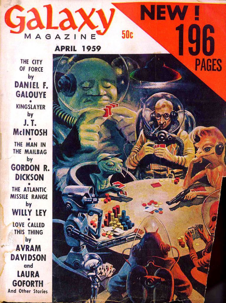
#9 Galaxy v17, 1959
Bold lettering announces *Galaxy Magazine* and “April 1959,” while a bright corner blares “NEW! 196 PAGES” beside the classic 50-cent price—an instant time capsule of mid-century newsstand science fiction. The cover’s layout balances salesmanship and spectacle: a clean column of story titles on the left, and a richly painted scene on the right that pulls…
-
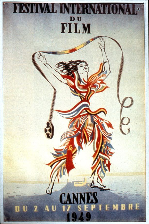
#5 1949: A distinct lack of funds led to there being no festival in 1948, but never fear, it was back the year afterwards with a slightly dubious Olympic-style poster.
Bold letters at the top announce “Festival International du Film,” while the lower edge anchors the design with “Cannes” and the year 1949, framing a piece of cover art that doubles as a promise: the festival has returned. After the previous year’s absence, the poster reads like a public declaration that cinema—and the civic pride…
-
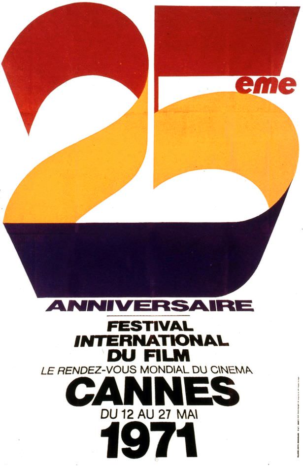
#21 1971: The 25th anniversary of the awards.
Bold, sweeping numerals dominate this cover art, turning “25” into a ribbon of color that feels both celebratory and distinctly early-1970s in its graphic confidence. The palette—warm reds and golds anchored by a deep, inky base—suggests a festival atmosphere while keeping the design clean and instantly legible. Even without depicting people or scenes, the composition…
-
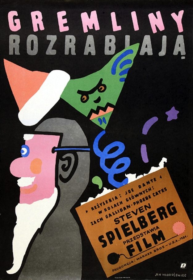
#13 Gremlins. Artist: Jan Mlodozeniec. Year: 1985
Bright, cut-paper shapes and bold lettering make Jan Mlodozeniec’s 1985 “Gremliny” poster feel instantly mischievous, as if the design itself is playing tricks. The Polish title “Gremliny Rozrabiają” stretches across a deep black field, while a jagged, green creature in a pointed hat hovers above the scene, its sharp teeth and narrowed eyes signaling cartoon…
-
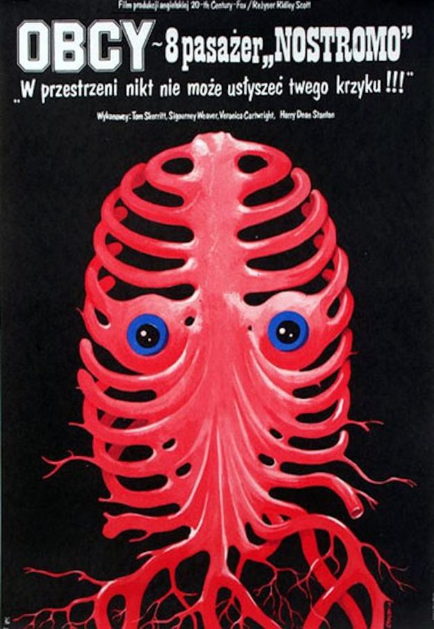
#29 Alien. Artist: Jakub Erol. Year: 1980
Polish lettering looms at the top of this 1980 cover art for “Alien,” credited to artist Jakub Erol, immediately setting a stark, ominous tone. Beneath the title, a single red form dominates the black field: part ribcage, part mask, part organism, its curves arranged like a skeletal lattice. Two wide, blue-ringed eyes stare out from…
-

#45 Wall Street. Artist: Andrzej Pagowski. Year: 1988
Bold color blocks and torn-paper textures frame the title “Wall Street” in a design that feels as sharp and restless as the market itself. Andrzej Pągowski’s 1988 cover art stacks handwritten credits across a loud orange band, then lets the typography collide with floating U.S. banknotes—an immediate signal that money isn’t just a theme here,…
-
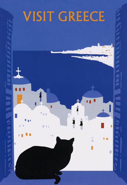
#16 Around the World in Posters: A Look at Vintage Travel Advertising #16 Cover Art
Bold lettering invites you to “Visit Greece,” and the design does the rest with a striking, minimalist palette of deep blues and crisp whites. Against the night-sky tone, whitewashed buildings stack and spill down a hillside, their rounded domes and small crosses forming a skyline that feels instantly Mediterranean. Tiny window accents in warm hues…
-
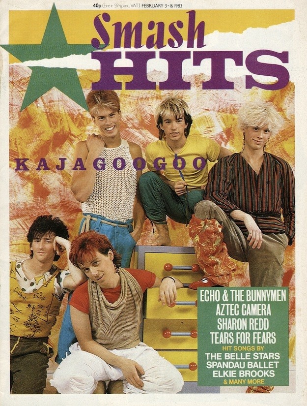
#5 Inside Smash Hits: The Iconic Magazine Covers of the 1980s #5 Cover Art
Bold lettering and loud, playful color are doing most of the talking here, with “Smash Hits” splashed across the top and a big star stamping the design like a pop-culture seal. The cover spotlights Kajagoogoo in styled, early-’80s fashion—sharp hair, confident poses, and a studio-set backdrop that feels half music video, half teen-bedroom daydream. Even…
-

#21 Inside Smash Hits: The Iconic Magazine Covers of the 1980s #21 Cover Art
Bold typography and electric color announce the era immediately: a Smash Hits cover where the masthead looms huge above a tightly framed, stylized portrait. The model’s bright red hair, feathered like a punk halo, and the fine, graphic “crackle” lines around the eyes feel like a collision of fashion editorial and pop-art illustration—exactly the kind…
-
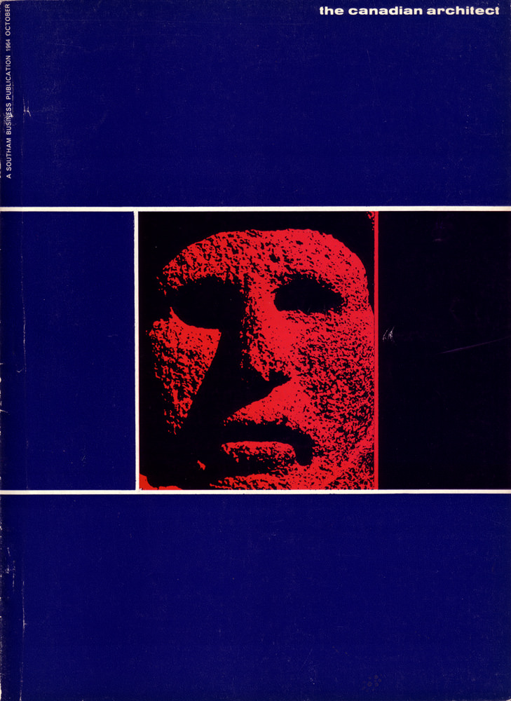
#3 The Canadian architect – October 1964
Bold blocks of deep blue and a razor-straight white grid frame a startling red relief face on the cover of *The Canadian Architect* (October 1964). The design leans into mid-century modern graphic language—high contrast, hard edges, and a deliberately limited palette—so the viewer’s attention lands immediately on texture and shadow. Even in a still cover…