Category: Cover Art
Dive into a gallery of vintage cover art from books, magazines, and albums. Discover how graphic design and illustration reflected the moods of their times.
These covers capture the essence of cultural evolution — from bold propaganda to elegant minimalism.
-
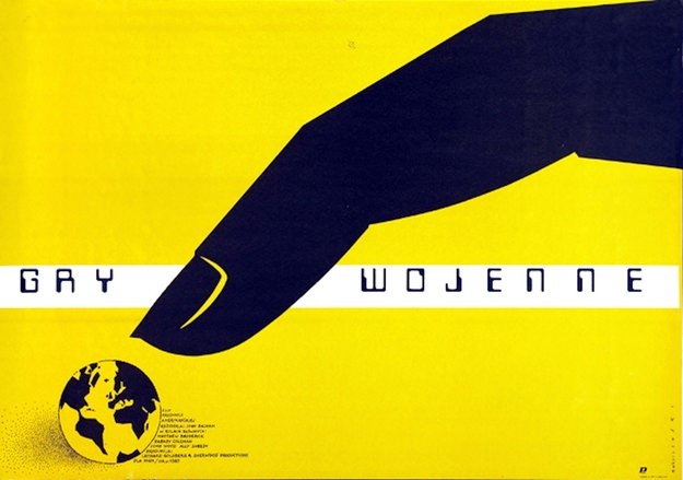
#3 25. War Games. Artist: Mieczyslaw Wasilewski. Year: 1985
Bold yellow floods the frame while a single, oversized black hand reaches down with unsettling calm, its fingertip poised above a small globe. The title “Gry wojenne” stretches across a stark white band, the lettering spaced like a coded message, turning a simple phrase—war games—into something cold and procedural. As cover art by Mieczysław Wasilewski…
-

#19 Ordinary People. Artist: Jan Mlodozeniec. Year: 1983
Bold blocks of red, yellow, green, and blue stack together like a small crowd, each simplified face reduced to a few strokes—a nose, a mouth, a dot for an eye—yet still unmistakably human. Jan Mlodozeniec’s 1983 cover art for “Ordinary People” leans into playful abstraction, using crisp geometry and flat color to suggest personalities pressed…
-
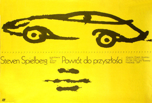
#35 Back to the Future. Artist: Mieczyslaw Wasilewski. Year: 1986
Bold yellow floods the page, turning the poster into a warning sign and a promise at the same time. A few swift black strokes outline a low, futuristic car, rendered more like a memory or a sketch than a machine—an economical mark that instantly reads as speed, invention, and motion. The sparse composition pulls the…
-
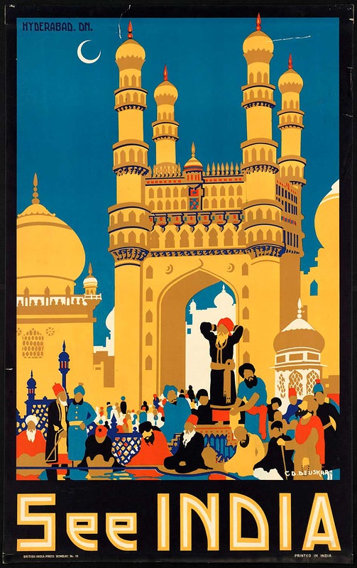
#6 Around the World in Posters: A Look at Vintage Travel Advertising #6 Cover Art
Bold blocks of color and crisp geometry pull the eye straight toward Hyderabad’s famous Charminar, rendered here as an irresistible symbol of spectacle and destination. A crescent moon hangs in a deep blue sky while domes and minarets rise like stage scenery, turning architecture into a promise of adventure. The large “See INDIA” lettering anchors…
-
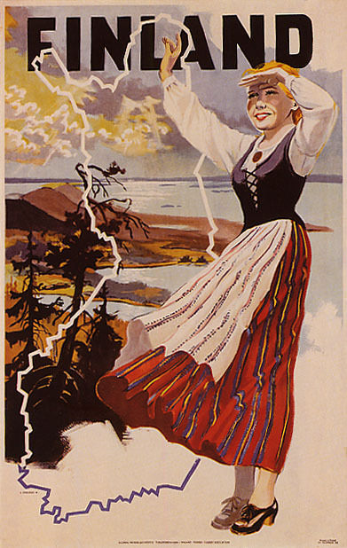
#22 Around the World in Posters: A Look at Vintage Travel Advertising #22 Cover Art
Bold lettering spells “FINLAND” across the top, setting the tone for a piece of vintage travel advertising cover art designed to stop passersby in their tracks. A woman in traditional-style dress stands in the foreground, her skirt striped with warm reds and oranges that contrast against the cooler coastal landscape behind her. The composition feels…
-
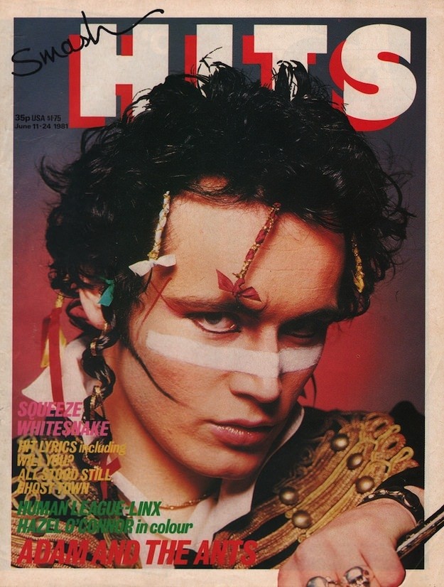
#11 Inside Smash Hits: The Iconic Magazine Covers of the 1980s #11 Cover Art
Bold type and louder color blocks announce the unmistakable world of *Smash Hits*, where pop wasn’t just heard—it was packaged as attitude. The cover art leans into immediacy: a close, confrontational portrait framed by oversized lettering, with the magazine’s masthead towering behind the subject like a stage backdrop. Even the price and issue details tucked…
-

#4 A Blast from the Past: Exploring the World of Vintage Teen Magazine Covers #4 Cover Art
Golden, sun-warmed colors and a close-up portrait set the tone on this classic *TEEN* magazine cover, priced at 35¢ and dated July 1965. The young model’s direct gaze is framed by daisy petals, a visual shorthand for innocence and daydream romance that fit perfectly with mid-century youth culture. Across the top, the masthead promises “Young…
-
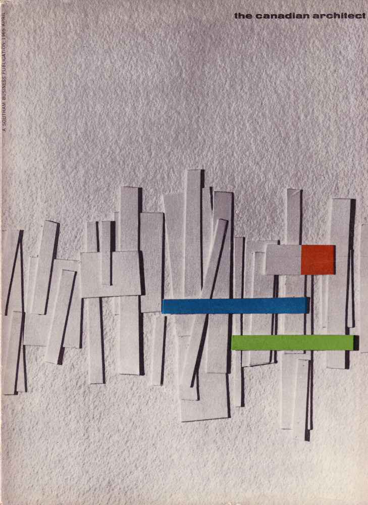
#9 The Canadian architect – April 1965
Against a softly textured grey field, the April 1965 cover of *The Canadian Architect* arranges slim white panels like a clustered skyline, their shadows giving the composition a quiet sense of depth and rhythm. Three crisp bars—blue, green, and a small red block—cut across the midsection, lending a mid-century modern punch of color that feels…
-

#25 The Canadian architect – October 1966
Bold geometry dominates the cover of *The Canadian Architect* for October 1966, where interlocking, cube-like forms float against a wide field of white. Thick black outlines carve the composition into crisp planes of red, yellow, blue, and green, creating the illusion of depth and movement without depicting any single building. A band of fine vertical…
-

#14 So Bad, They’re Good: Vintage Album Covers That Will Make You Laugh #14 Cover Art
Lurid color and theatrical posing make this “Rito Esclavo” cover hard to look away from, which is exactly why it earns a spot in any “so bad, they’re good” gallery of vintage album covers. A bound figure kneels in the foreground while another person stands beside them, the rope and staging leaning heavily into shock-value…