Category: Cover Art
Dive into a gallery of vintage cover art from books, magazines, and albums. Discover how graphic design and illustration reflected the moods of their times.
These covers capture the essence of cultural evolution — from bold propaganda to elegant minimalism.
-
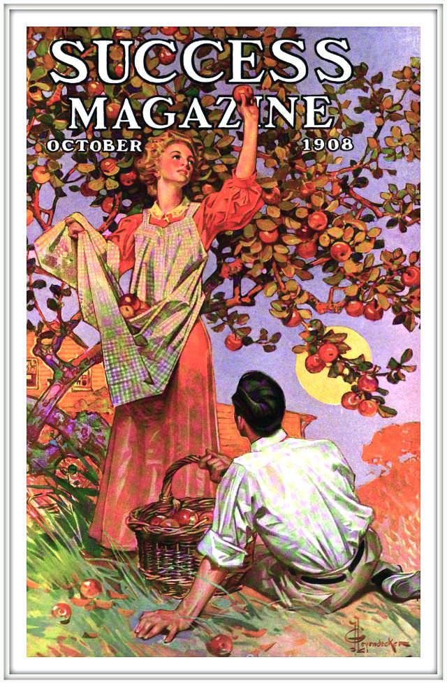
#23 Success magazine, October 1908
Bold lettering crowns the cover—“SUCCESS MAGAZINE”—with “OCTOBER 1908” tucked beneath, setting a confident tone before the scene even begins. Below the masthead, a woman in a long dress and apron reaches up into a fruit-laden tree, her arm extended toward clusters of ripe red apples. The palette glows with autumn warmth: deep greens in the…
-
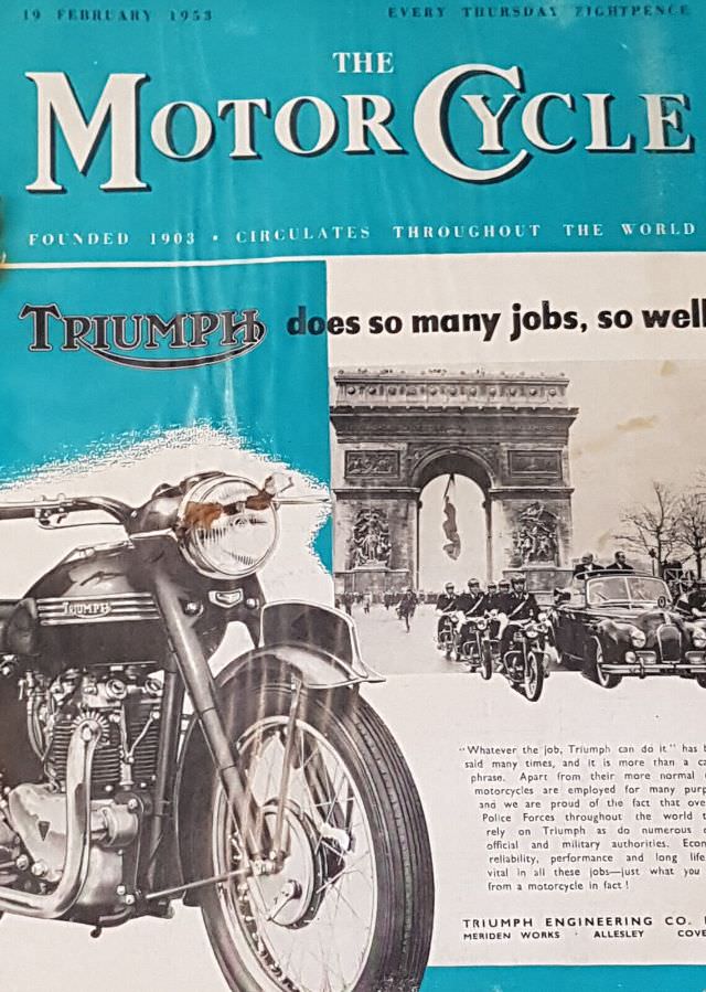
#13 The Motor Cycle magazine, February 19, 1953
Bold turquoise and crisp serif lettering announce **The Motor Cycle** at a glance, with the masthead flanked by the issue line “19 February 1953” and the weekly promise “Every Thursday.” The cover art leans into mid-century magazine design, balancing a clean block of color with a carefully composed layout that makes the title feel authoritative…
-
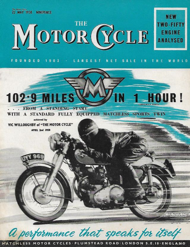
#29 The Motor Cycle magazine, May 22, 1958
Bold typography and teal-and-white graphic flair announce the May 22, 1958 issue of *The Motor Cycle*, a classic piece of mid-century motorcycle magazine cover art. The masthead and price line set the period instantly, while the layout balances big claims with technical intrigue—exactly the kind of newsstand energy that made weekly motoring titles so collectible.…
-
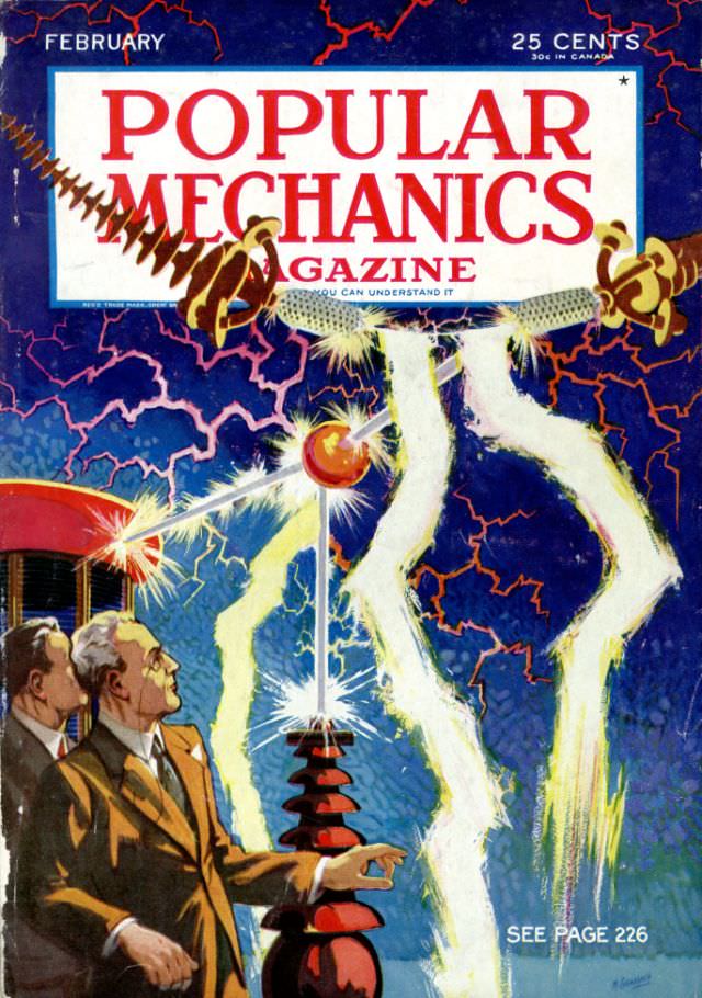
#10 Popular Mechanics magazine cover, February 1933
Bold red lettering announces **Popular Mechanics Magazine** across the top of this February 1933 cover, priced at 25 cents (30 cents in Canada), setting an energetic tone before the eye drops into a stormy field of electric blue. Jagged, lightning-like lines spread across the background while brilliant white arcs leap between metal components, turning the…
-
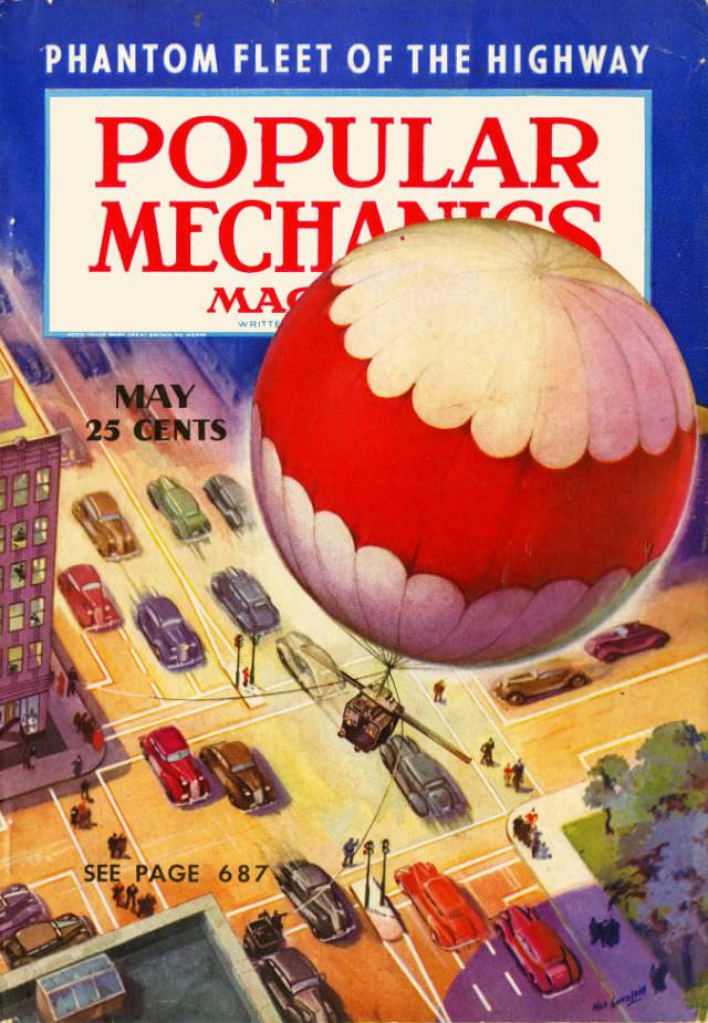
#26 Popular Mechanics magazine cover, May 1938
Bold red lettering for “Popular Mechanics” dominates the May 1938 magazine cover, framed by a deep blue border and a headline that promises “Phantom Fleet of the Highway.” Beneath the masthead, the cover art plunges into a busy city intersection where streamlined cars crowd the lanes and pedestrians cluster at the corners. The price—25 cents—sits…
-
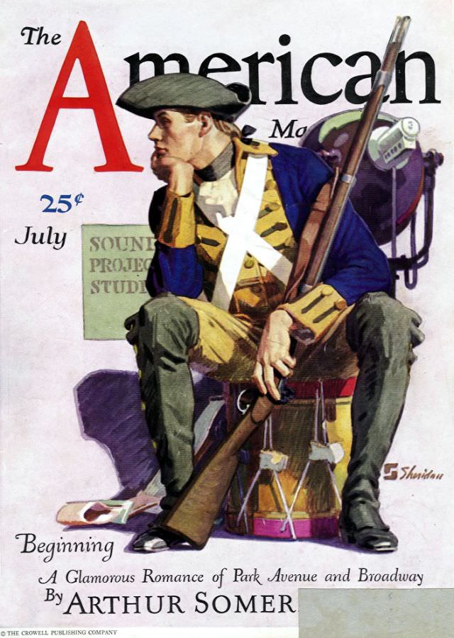
#2 The American Magazine cover, July 1930
Bold lettering and clean, confident design announce *The American Magazine* for July 1930, priced at 25¢—a small detail that instantly places the cover in its era. Dominating the composition is an illustrated figure dressed in an old-fashioned, military-inspired outfit, seated with a long rifle resting against his shoulder and a large pack slung behind him.…
-
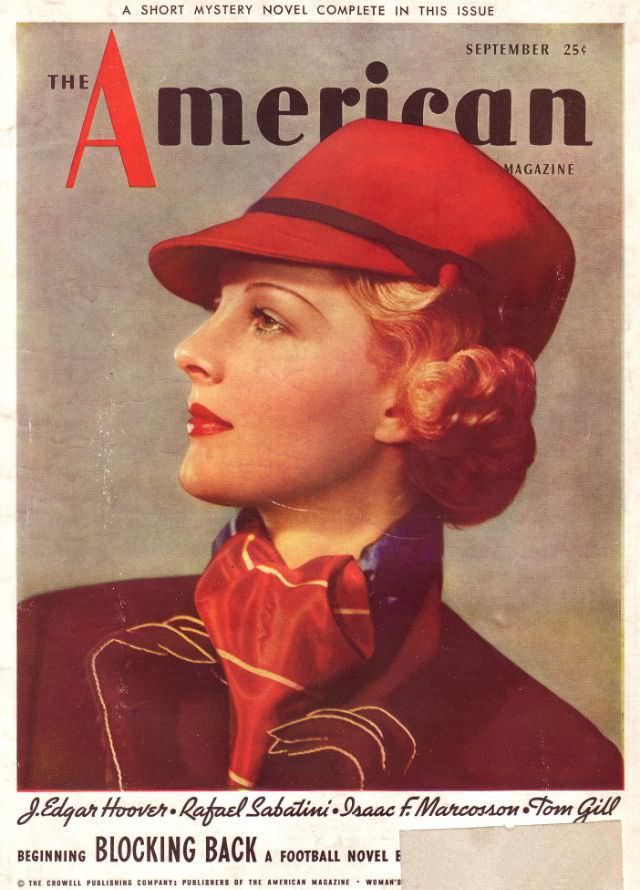
#18 The American Magazine cover, September 1936
Bold typography and a sweep of crimson immediately set the tone on this September 1936 cover of *The American Magazine*. A poised woman in profile dominates the design, her red cloche-style hat and matching scarf rendered with the smooth, airbrushed glamour that defined so much interwar illustration. The muted background keeps the eye on her…
-

#34 The American Magazine cover, July 1939
July 1939 arrives in bold color on the cover of *The American Magazine*, where a smiling young woman is posed on what looks like a ship’s deck, framed by railings and rigging against a blue sea-and-sky backdrop. Her wide-brimmed hat, plaid overcoat, and bright scarf give the illustration a breezy, travel-ready mood, the kind of…
-
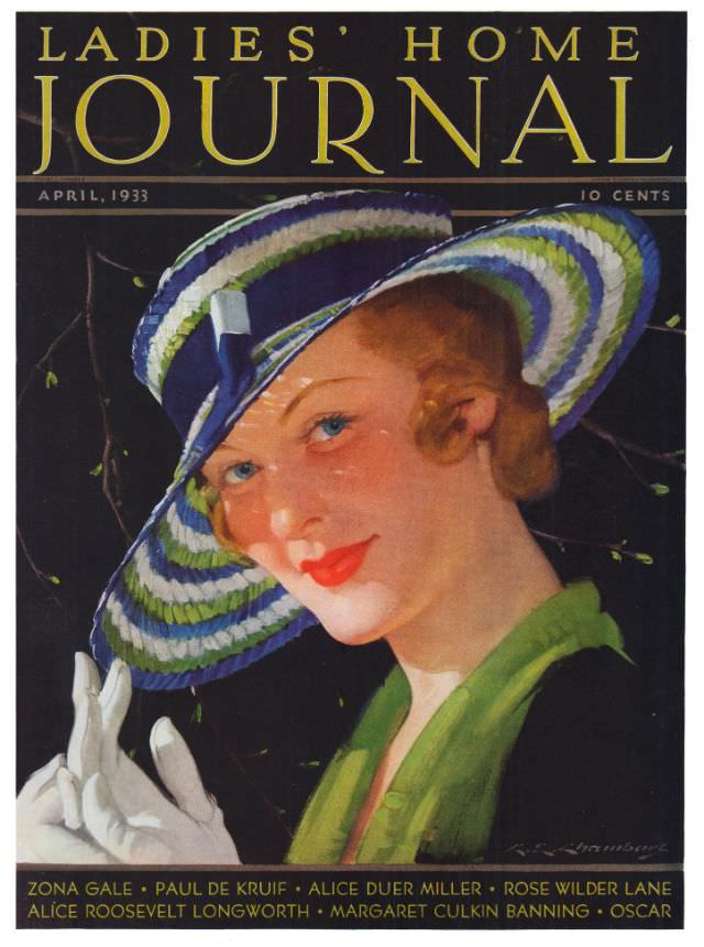
#12 Ladies’ Home Journal, April 1933
Bold gold lettering crowns the April 1933 issue of *Ladies’ Home Journal*, setting an elegant stage for a poised illustrated woman in a wide-brimmed hat banded in blue, green, and white. Her angled pose and direct gaze feel intentionally modern, while the glossy red lipstick and softly rouged cheeks highlight the era’s streamlined beauty ideals.…
-
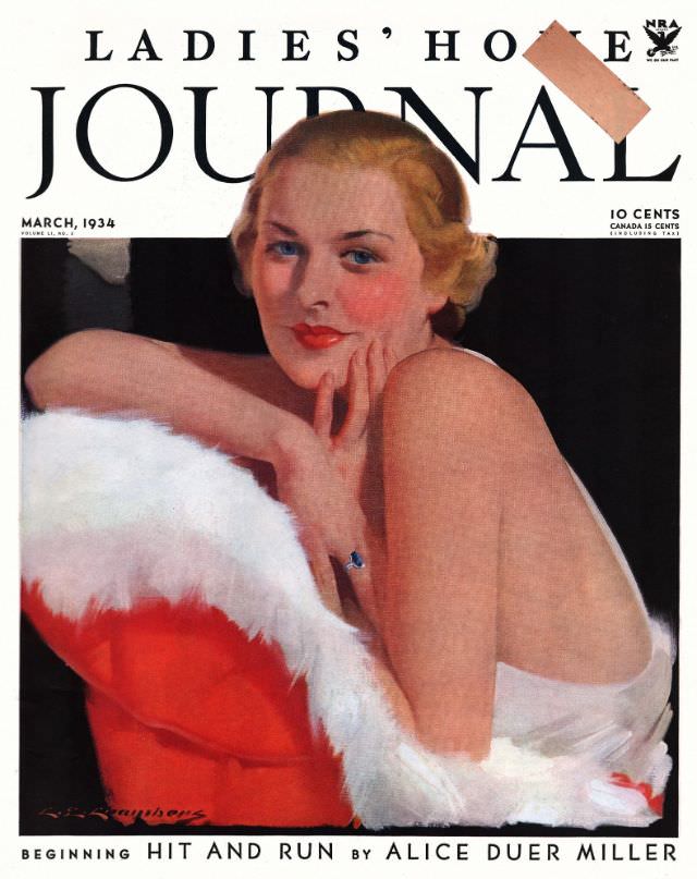
#28 Ladies’ Home Journal, March 1934
March 1934 arrives in full Art Deco poise on the cover of *Ladies’ Home Journal*, where a blonde woman meets the reader’s gaze with an easy confidence. Her rouged cheeks and glossy red lips feel unmistakably of the era, while the creamy white wrap and saturated red cushion create a bold, poster-like contrast against a…