Category: Cover Art
Dive into a gallery of vintage cover art from books, magazines, and albums. Discover how graphic design and illustration reflected the moods of their times.
These covers capture the essence of cultural evolution — from bold propaganda to elegant minimalism.
-

#25 The Canadian architect – October 1966
Bold geometry dominates the cover of *The Canadian Architect* for October 1966, where interlocking, cube-like forms float against a wide field of white. Thick black outlines carve the composition into crisp planes of red, yellow, blue, and green, creating the illusion of depth and movement without depicting any single building. A band of fine vertical…
-
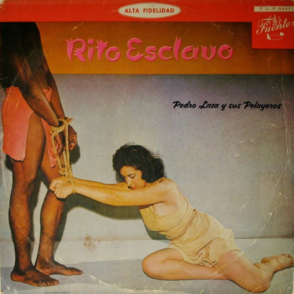
#14 So Bad, They’re Good: Vintage Album Covers That Will Make You Laugh #14 Cover Art
Lurid color and theatrical posing make this “Rito Esclavo” cover hard to look away from, which is exactly why it earns a spot in any “so bad, they’re good” gallery of vintage album covers. A bound figure kneels in the foreground while another person stands beside them, the rope and staging leaning heavily into shock-value…
-
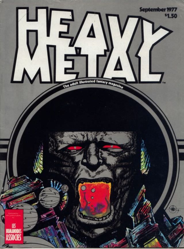
#5 Heavy Metal Magazine Covers: A 1970s Blast of Sci-Fi and Fantasy #5 Cover Art
Bold block lettering shouting “HEAVY METAL” crowns the cover, with the tagline “The adult illustrated fantasy magazine” tucked beneath it like a dare. In the corner, “September 1977” and the price “$1.50” anchor the piece in its era, when newsstands still served as galleries for boundary-pushing sci‑fi and fantasy art. Even before the illustration pulls…
-

#21 Heavy Metal Magazine Covers: A 1970s Blast of Sci-Fi and Fantasy #21 Cover Art
Bold orange lettering sprawls across the top of the cover, announcing HEAVY METAL with the kind of typographic confidence that defined late-1970s magazine racks. In the corner, the issue is marked May 1979 with a $1.50 cover price, while a diagonal banner teases an illustrated story tied to “Alien,” neatly linking the magazine’s fantasies to…
-
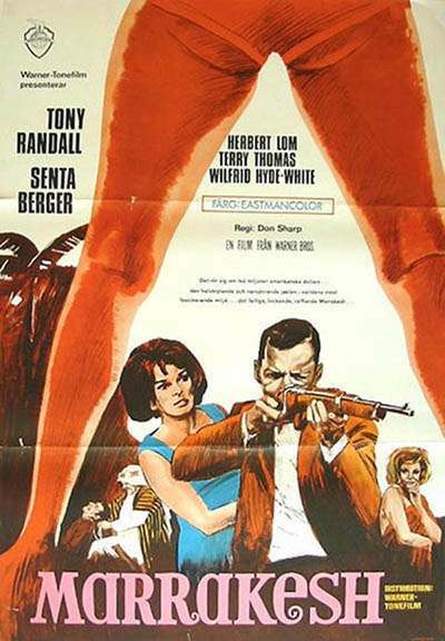
#12 The A-Frame’s Influence: How This Iconic Pose Continues to Shape Modern Fashion, Art, and Movie Posters #12
Between a pair of bold, red-orange legs that form a dramatic A-shaped arch, the eye is pulled straight into a scene of danger and allure—an instantly legible piece of cover art that uses the body as architecture. The pose turns negative space into a spotlight, framing the action like a stage proscenium and making the…
-

#5 The Human Factor (1975)
A giant clock face dominates the cover art for *The Human Factor (1975)*, its bold numerals and looming hands turning time into a threat rather than a comfort. Set against that relentless countdown, the composition throws the viewer straight into the pulse of a 1970s thriller mood—high stakes, hard edges, and the sense that one…
-
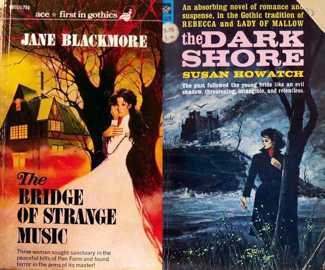
#4 The Psychological Appeal of Women Running from Houses on Gothic Romance Covers #4 Cover Art
Across classic Gothic romance cover art, few motifs feel as instantly legible as a solitary woman poised between shelter and danger, and the paired covers here lean into that visual shorthand with gusto. On the left, a white-gowned figure clutches herself near a looming tree while a house glows with warm windows behind her, the…
-

#20 The Psychological Appeal of Women Running from Houses on Gothic Romance Covers #20 Cover Art
Across two paperback gothic romance covers, the same visual grammar repeats: a looming house, a night sky thick with blue-green haze, and a lone woman caught mid-flight. On the left, “Diary of Evil” frames its heroine in a pale, flowing gown, her movement pulling the eye away from the darkened windows behind her. On the…
-
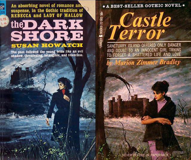
#36 The Psychological Appeal of Women Running from Houses on Gothic Romance Covers #36 Cover Art
Brooding skies, wind-tossed trees, and a stark shoreline set the stage for two classic Gothic romance paperback covers, where danger feels as natural as the landscape itself. Each composition places a solitary woman in the foreground—dark coat, tense posture, downcast gaze—while a looming mansion or castle crouches in the distance like a memory that won’t…
-
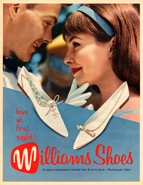
#10 Groovy Threads and Bold Ads: A Trip Through 1960s Fashion in Seventeen Magazine #10 Cover Art
Bright lipstick, a sleek headband, and a close, smiling gaze set the tone for this piece of Seventeen-style cover art, where romance and retail meet in the language of mid-century teen dreams. The illustration leans into the era’s polished optimism—softly airbrushed skin tones, tidy hair, and a pastel palette that feels like a soda-shop day…