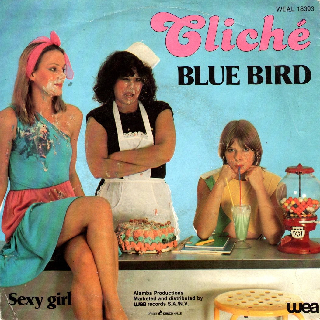
Candy colors and deadpan attitude collide on this offbeat piece of cover art, where a teal-blue backdrop frames a tableau that feels equal parts pop advertisement and wink at domestic life. The playful typography—“Cliché” in bubblegum pink above “BLUE BIRD” in bold black—sets a tone that’s knowingly theatrical, as if the sleeve itself is daring you to take it seriously. Even the scuffs and wear on the print add to the period flavor, reminding us how these objects lived in stacks of records, handled and replayed until the corners softened.
At the center, three figures are staged like characters in a strange little sitcom: a woman in a bright headband and dress, a stern-looking server in apron and cap, and a bored youth nursing a milkshake through a straw. A decorated cake sits on the counter, while a red gumball machine anchors the right edge—props chosen for instant recognition and slightly surreal contrast. The overall composition leans into the “unusual and unconventional” spirit associated with late-1960s and 1970s album cover design, when visual storytelling often borrowed from fashion spreads, commercials, and satire.
Printed text at the bottom—“Sexy girl,” along with label markings including “WEA”—hints at how marketing language and imagery were packaged to provoke curiosity in a record shop bin. For collectors and design historians, sleeves like this are miniature time capsules: bold color blocking, staged humor, and everyday objects turned into symbols. If you’re exploring unconventional album cover designs from the 1960s and 1970s, this one offers a perfect snapshot of how cover art could be both catchy and weird, inviting listeners into a world before a single note played.