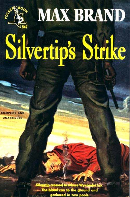
Dominating the frame with legs planted wide, the central figure turns a simple stance into a statement of power—an A-shaped silhouette that locks your eye in place and leaves little doubt about who controls the scene. The low viewpoint, the strong verticals of the trousers, and the clenched hands near the hips work like visual punctuation, amplifying tension before you even read the cover text. Bold lettering and high-contrast color push the drama further, a classic piece of cover art design built to stop a passerby cold.
At the bottom edge, a fallen man in red lies on the ground as smoke curls upward, giving the composition a grim narrative anchor and making the pose above feel even more imposing. The wide-legged stance creates a “gateway” in the center of the image, drawing attention downward and then back up again—an efficient loop that poster artists and illustrators have relied on for decades. Even without a specific date or place, the overall styling echoes mid-century pulp aesthetics: heightened stakes, simplified forms, and a cinematic sense of confrontation.
From fashion editorials to movie posters and modern art photography, the A-frame continues to signal confidence, dominance, and readiness, whether it’s worn as swagger on a runway or used as shorthand for a showdown on a one-sheet. Designers still borrow the same trick seen here: crop high, shoot low, exaggerate the legs, and let negative space do the storytelling. For anyone tracing how iconic poses travel across visual culture, this cover offers a compact lesson in why the A-frame endures—and how a single stance can shape an entire era of image-making.