Category: Cover Art
Dive into a gallery of vintage cover art from books, magazines, and albums. Discover how graphic design and illustration reflected the moods of their times.
These covers capture the essence of cultural evolution — from bold propaganda to elegant minimalism.
-
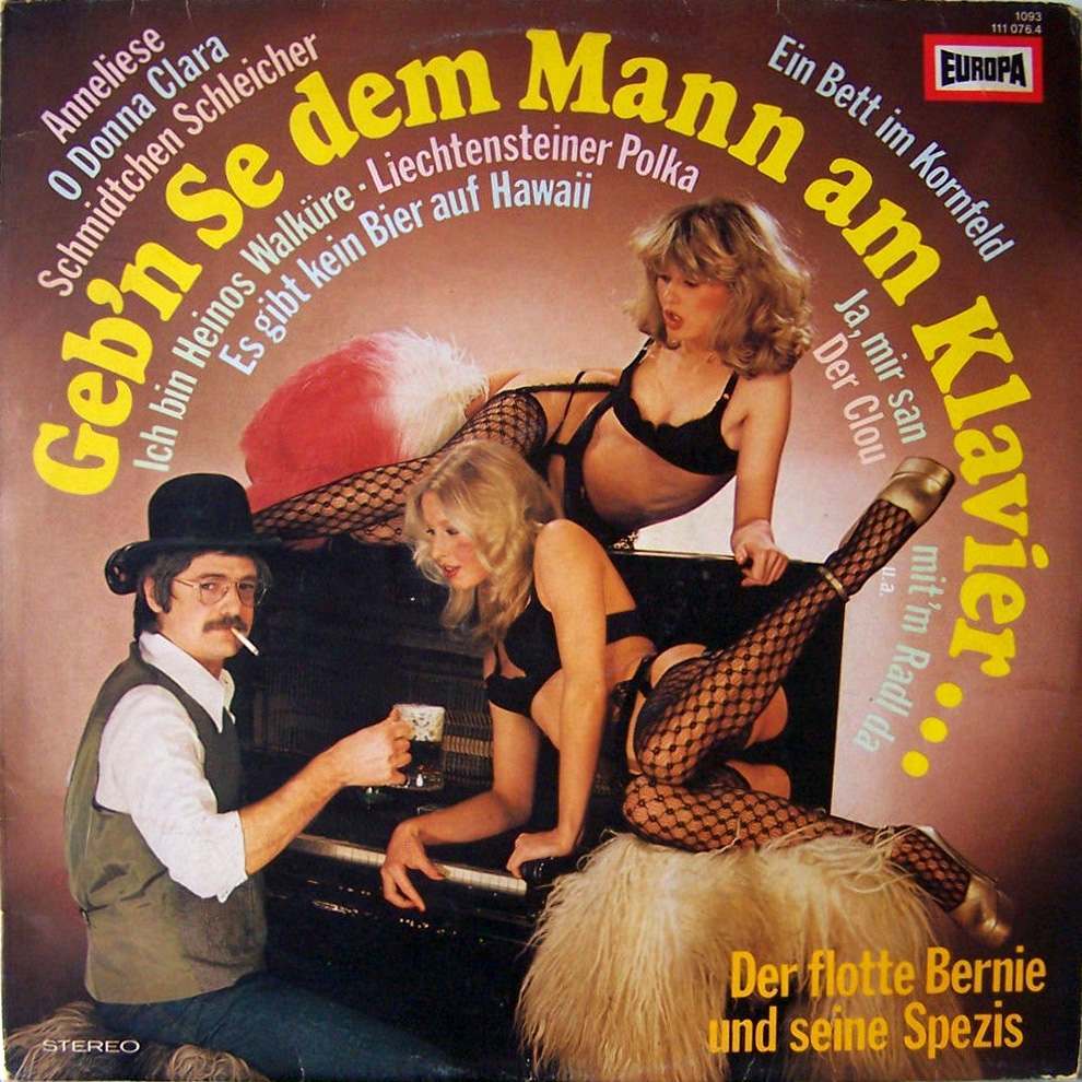
#11 Pianos, Pin-Ups, and Party Tunes: Exploring the Wild World of Honky-Tonk Records #11 Cover Art
Neon-bright lettering and cheeky staging turn this record sleeve into a little theater of after-hours fantasy: a man in hat and vest, cigarette at the lip and beer in hand, posed beside a piano while two lingerie-clad models sprawl across the instrument in fishnets and heels. The typography shouts in German—“Geb’n Se dem Mann am…
-
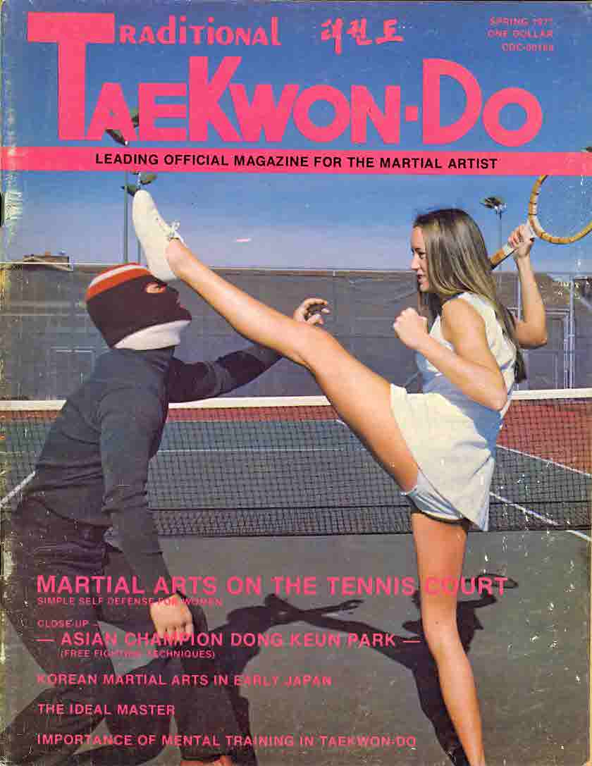
#7 Everybody Was Kung Fu Fighting: Exploring the Heyday of Martial Arts Mags in the 1970s and 1980s #7 Cov
Bold, bubblegum-pink lettering shouting “Traditional TaeKwon-Do” crowns a sunlit action scene that could only have come from the magazine racks of the martial arts boom. A high kick freezes mid-strike while a partner braces behind a padded target, turning a familiar sports setting into a stage for spectacle and technique. Even the tagline—positioning itself as…
-
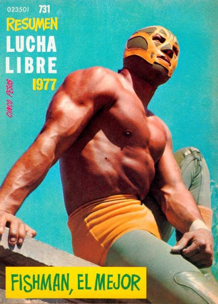
#11 Blood, Masks, and Glory: A Visual Tour Through Lucha Libre Magazine Covers of the 1970s #11 Cover Art
Under a saturated turquoise sky, a masked luchador rises in a low-angle pose that turns muscle and fabric into pure monument. The cover’s bold typography—“Resumen Lucha Libre 1977”—sits beside the figure like a marquee, while the yellow-and-green gear and gold mask lock the palette into the unmistakable language of 1970s Mexican wrestling promotion. Even without…
-

#27 Blood, Masks, and Glory: A Visual Tour Through Lucha Libre Magazine Covers of the 1970s #27 Cover Art
Bold color and iconic masks jump off this 1970 cover of *Lucha Libre*, a weekly magazine that turned Mexican wrestling into pop-art spectacle. Against a bright yellow field, two masked profiles dominate the frame in clean, graphic contrast—one in deep blue with a white trim, the other in a pale silver—creating a face-to-face tension even…
-
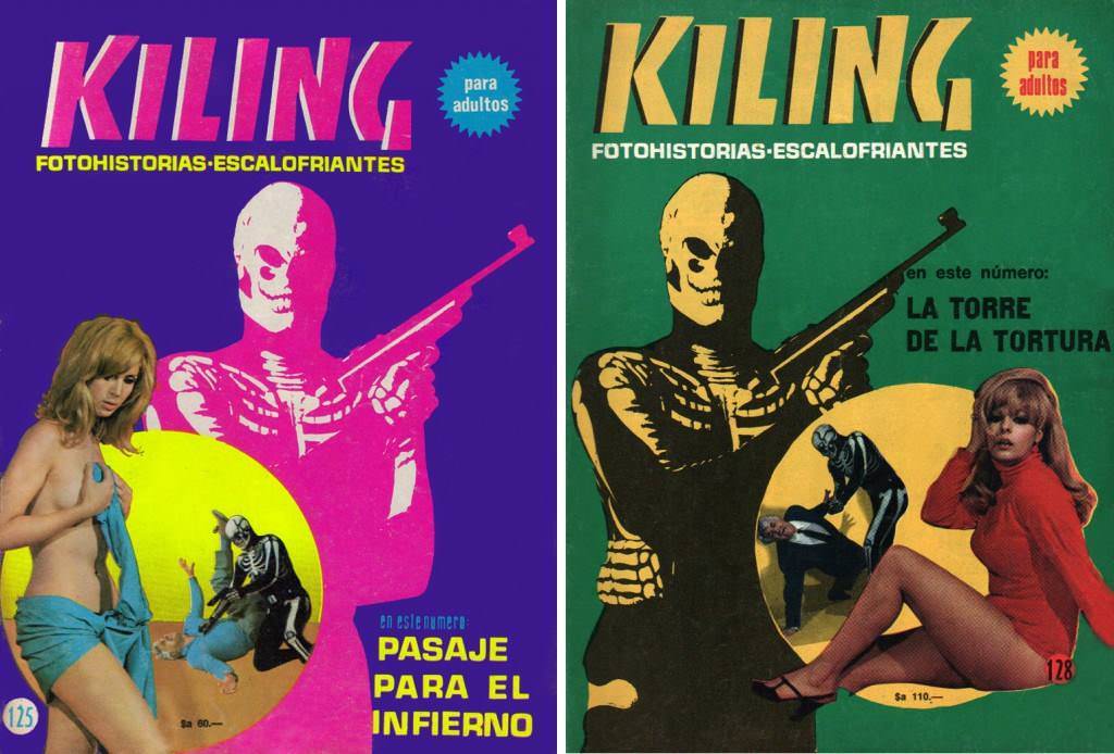
#5 The World of Spanish and Italian Crime Comics (Fotonovelas) from the 1960s-70s: Stories Told with Sensational Photogr
Neon color and pulp menace collide on this pair of “KILING” covers, where the bold headline “FOTOHISTORIAS-ESCALOFRIANTES” promises chilling photo-stories aimed “para adultos.” A skull-faced gunman dominates the composition in high-contrast silhouette, turning the central figure into a graphic emblem of danger rather than a character you can trust. The flat, saturated backgrounds—purple on one…
-
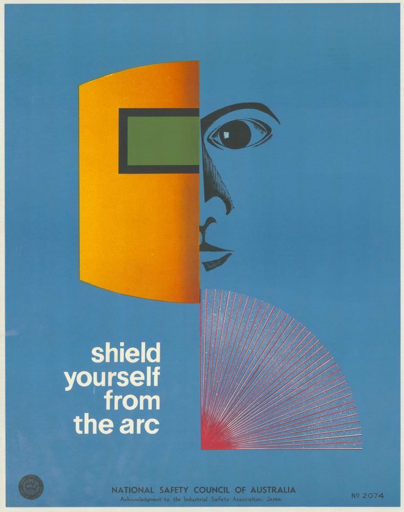
#9 National Safety Council of Australia Posters from the 1970s: Visual Messages for Keeping People Safe and Well
Bold colour blocks and razor-clean geometry give this 1970s National Safety Council of Australia poster an immediate, modern punch. A stylised face peers from the right edge while a protective visor or mask—rendered in warm orange with a green window—cuts across the composition, turning personal protective equipment into a graphic symbol. The short directive, “shield…
-
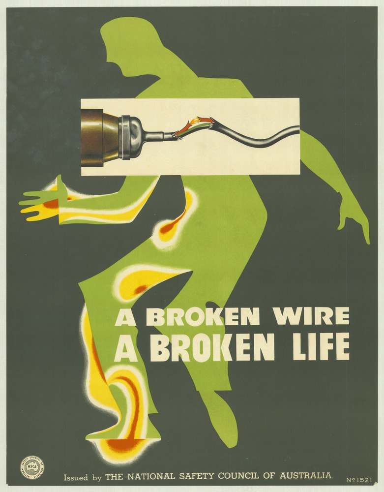
#25 National Safety Council of Australia Posters from the 1970s: Visual Messages for Keeping People Safe and Well
Bold graphic design does the talking here: a vivid green human silhouette staggers across a dark field while a severed electrical lead spits color like heat and danger. The slogan, “A BROKEN WIRE A BROKEN LIFE,” lands in heavy white type, turning a simple maintenance failure into a stark warning about what can happen in…
-
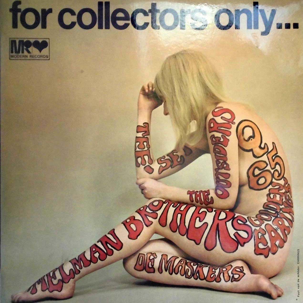
#10 The Unusual and Unconventional Album Cover Designs From the 1960s and 1970s #10 Cover Art
Across the top, the blunt promise “for collectors only…” sets the tone, while the small “MR Modern Records” mark hints at the record-industry machinery behind the provocation. Center stage is a nude figure seated in profile, used as a human canvas for oversized, bubbly typography in reds and oranges. The band name “The Allman Brothers…
-
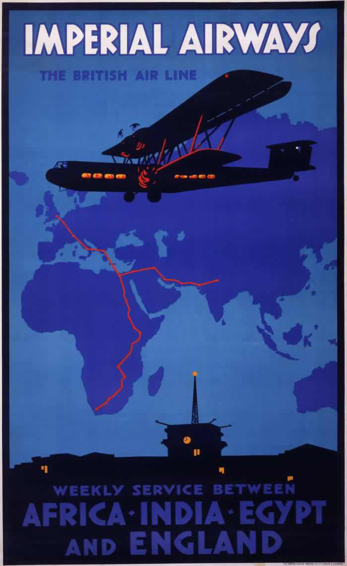
#12 Advertising the Skies: A Look at Imperial Airways Posters Promoting Early Air Travel in the 1920s and 1930s #1
Bold lettering at the top—“IMPERIAL AIRWAYS, THE BRITISH AIR LINE”—announces the promise of modern flight with the confidence of interwar graphic design. A streamlined biplane silhouette glides across a deep blue sky, its cabin windows glowing in warm orange, while stylized radio waves suggest cutting-edge communication and dependable navigation. The poster’s limited palette and strong…
-

#5 A Look Back at Vintage Modern Photography Magazine Covers from the 1950s and 1960s #5 Cover Art
Bold typography and a high-contrast split of black and white set the tone on this Modern Photography magazine cover, where a studio model’s pose doubles as a graphic design statement. The composition leans into mid-century modern aesthetics—clean edges, saturated red lettering, and a confident use of negative space—making the cover art feel as much like…