Category: Cover Art
Dive into a gallery of vintage cover art from books, magazines, and albums. Discover how graphic design and illustration reflected the moods of their times.
These covers capture the essence of cultural evolution — from bold propaganda to elegant minimalism.
-

#10 Everybody Was Kung Fu Fighting: Exploring the Heyday of Martial Arts Mags in the 1970s and 1980s #10 Co
Bright, punchy lettering across the top announces ACTION KARATE, complete with a cover line touting “the responsible voice of American karate,” a March issue marker, and even a 75¢ price—small details that instantly place this artifact in the boom years of martial arts magazines. The design leans into bold contrasts: a heavy black masthead, oversized…
-

#14 Blood, Masks, and Glory: A Visual Tour Through Lucha Libre Magazine Covers of the 1970s #14 Cover Art
Bold yellow lettering shouting “LUCHA LIBRE” crowns a dark, almost stage-like backdrop, instantly signaling the sensational world of Mexican wrestling magazines in the 1970s. The cover’s design leans into drama and spectacle: four masked faces float like a pantheon of fighters, each rendered in vivid color against black, with price and issue markings that evoke…
-
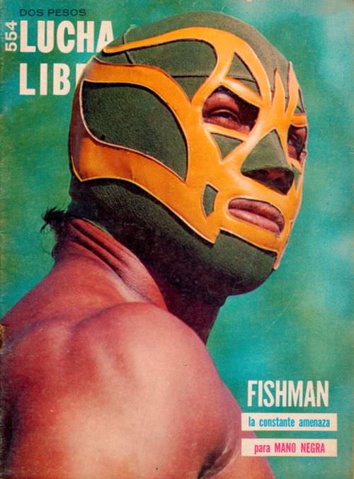
#30 Blood, Masks, and Glory: A Visual Tour Through Lucha Libre Magazine Covers of the 1970s #30 Cover Art
A teal wash and bold masthead announce the world of “LUCHA LIBRE” at the top, priced “DOS PESOS,” while a masked wrestler turns his shoulder toward the viewer in a classic, larger-than-life pose. The cover art leans into vivid color and high contrast: a deep green mask cut through with golden shapes, the eye and…
-
#8 The World of Spanish and Italian Crime Comics (Fotonovelas) from the 1960s-70s: Stories Told with Sensational Photogr
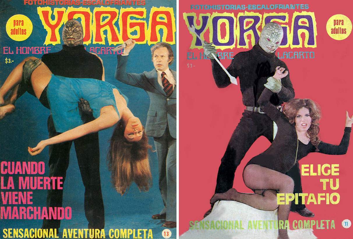
Lurid color, oversized lettering, and a masked “Yorga” looming over imperiled women—these covers plunge you straight into the heightened world of Spanish and Italian crime fotonovelas from the 1960s–70s. The Spanish text promises “fotonovelas escalofriantes” and “para adultos,” while the staged poses and theatrical menace sell danger at a glance, the same way movie posters…
-
#12 National Safety Council of Australia Posters from the 1970s: Visual Messages for Keeping People Safe and Well
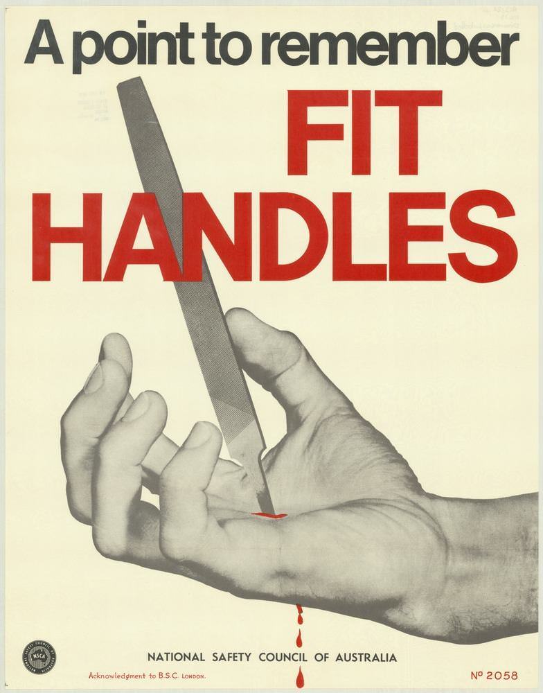
Bold typography does most of the talking here: “A point to remember” sits above the urgent command “FIT HANDLES,” set in large red letters that feel impossible to ignore. Below, a close-up of a hand steadies a metal file or blade-like tool, its sharp edge poised where a handle ought to be—an arresting moment that…
-
#28 National Safety Council of Australia Posters from the 1970s: Visual Messages for Keeping People Safe and Well
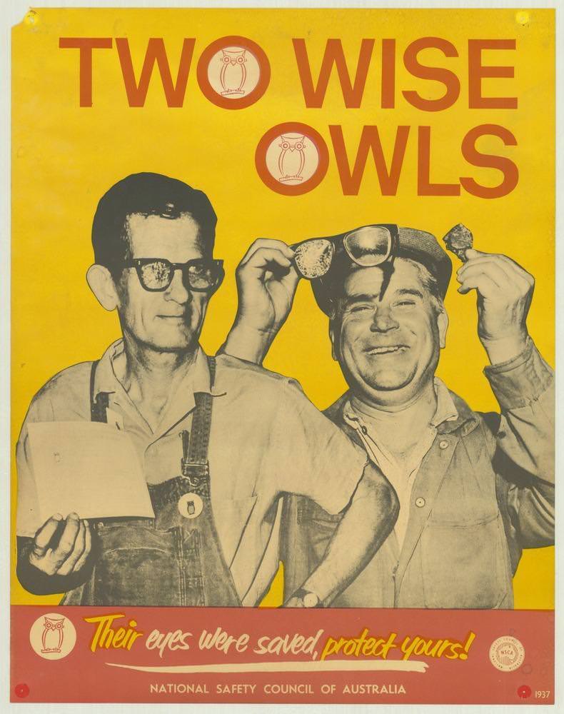
Bold yellow dominates the cover art, topped by the blunt headline “TWO WISE OWLS,” as two workers grin beneath the message. One man holds paperwork while the other lifts protective eyewear, turning a practical safety lesson into a moment of camaraderie. The owl symbols embedded in the lettering reinforce the idea of “wisdom” as something…
-
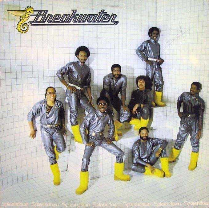
#13 The Unusual and Unconventional Album Cover Designs From the 1960s and 1970s #13 Cover Art
Chrome-like jumpsuits and canary-yellow boots turn a stark, tiled room into a stage set, where the band name “Breakwater” floats above the scene with a winged seahorse emblem. The grid walls suggest a laboratory, a showroom, or a futuristic bathroom—an intentionally odd backdrop that makes the figures look like they’ve stepped into a concept album…
-
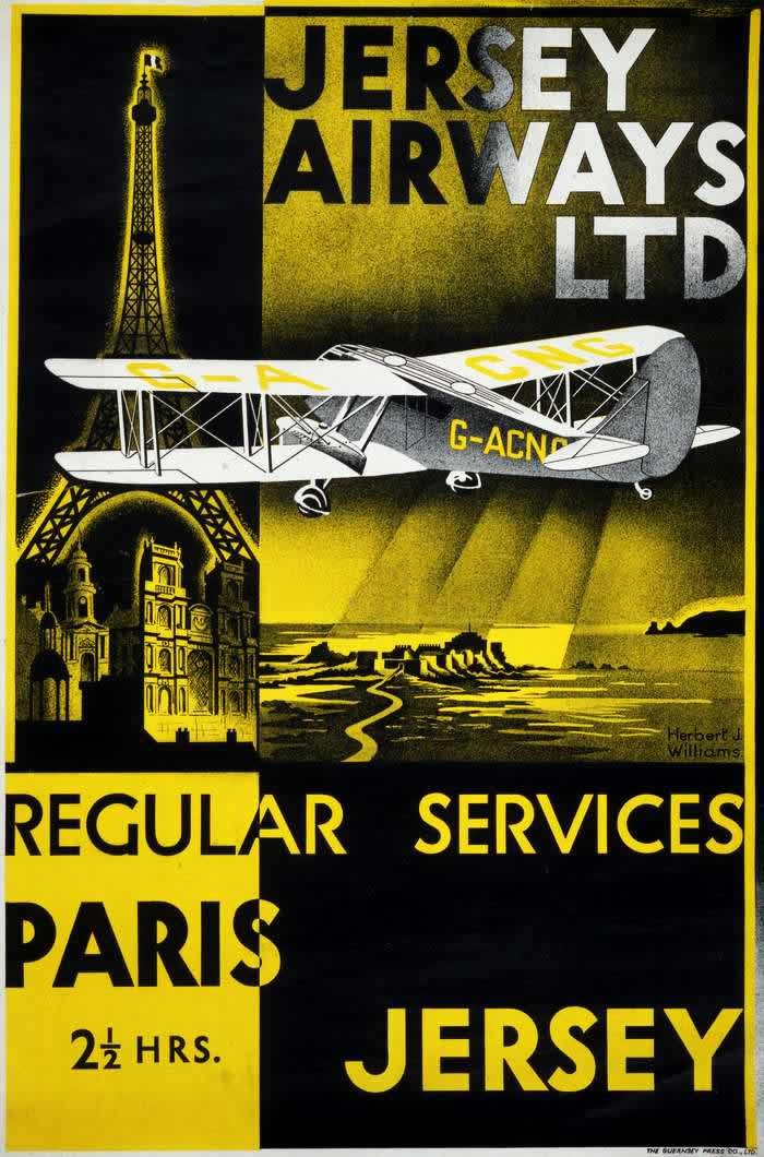
#15 Advertising the Skies: A Look at Imperial Airways Posters Promoting Early Air Travel in the 1920s and 1930s #1
Bold typography and dramatic blocks of yellow and black pull the eye straight into the promise of modern movement, with “Jersey Airways Ltd” dominating the upper field. A stylized biplane cuts across the composition, its registration letters visible on the fuselage, while landmark imagery—an unmistakable Eiffel Tower and a cathedral-like façade—anchors the route in recognizable…
-
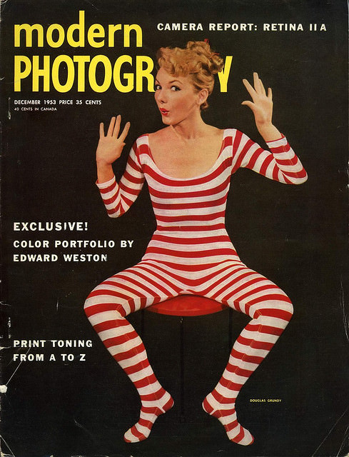
#8 A Look Back at Vintage Modern Photography Magazine Covers from the 1950s and 1960s #8 Cover Art
Bold typography and playful studio theatrics leap off this Modern Photography cover, where a model in red-and-white stripes poses against a deep black background with palms raised as if caught mid-performance. The high-contrast design, paired with the oversized “modern” and “PHOTOGRAPHY” masthead, embodies mid-century magazine cover art at its most attention-grabbing—clean, graphic, and made to…
-
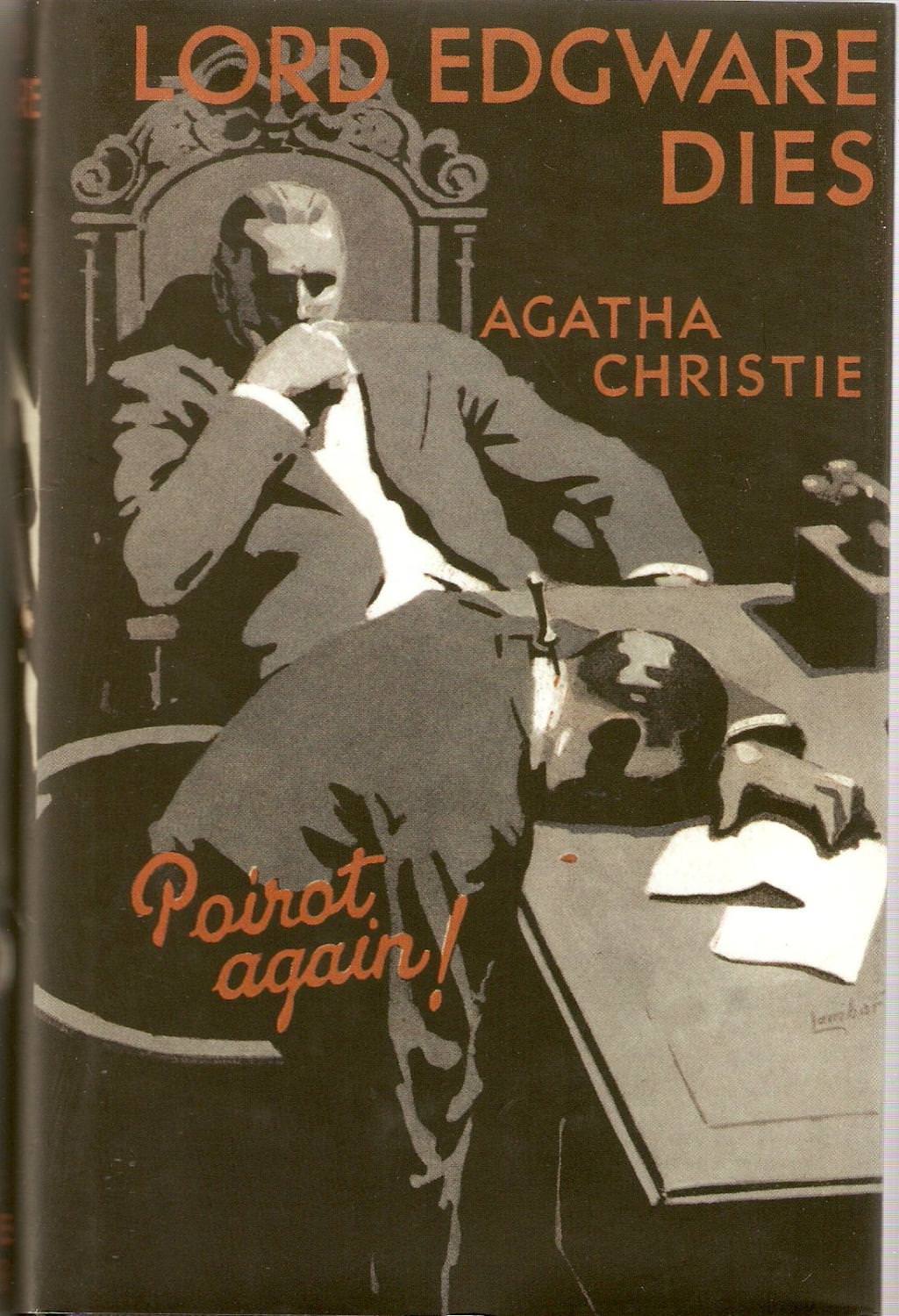
#4 Lord Edgware Dies, UK first edition cover, 1933
Bold orange lettering announces “LORD EDGWARE DIES” across a dark field, with “AGATHA CHRISTIE” set to the right in the same striking type. The design immediately frames the book as a piece of classic crime fiction, using high contrast and simplified shapes to pull the eye from title to author and down into the scene.…