Category: Cover Art
Dive into a gallery of vintage cover art from books, magazines, and albums. Discover how graphic design and illustration reflected the moods of their times.
These covers capture the essence of cultural evolution — from bold propaganda to elegant minimalism.
-
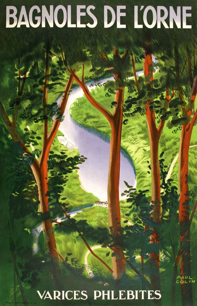
#32 Bagnoles de L’Orne, circa 1935
Bold lettering announces “Bagnoles de l’Orne,” while the artwork pulls you into a serene, wooded valley where a pale ribbon of water curves through lush greens. Tall, reddish trunks frame the view like stage wings, and the painterly brushwork suggests filtered light and deep summer shade. Small buildings tucked near the river hint at a…
-
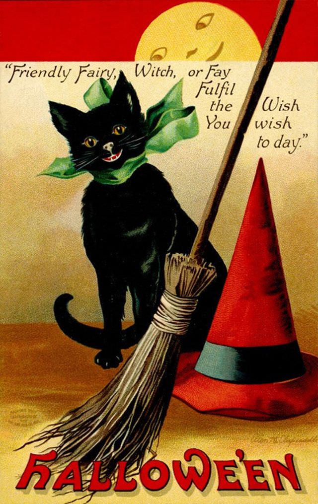
#8 Friendly Fairy, Witch or Fay
A wide-eyed black cat grins from the center of this cover art, its glossy fur set off by a bright green bow that feels more mischievous than menacing. Behind it, a soft, smiling moon watches over the scene, while a straw broom and a pointed red witch’s hat lean into the foreground like stage props…
-
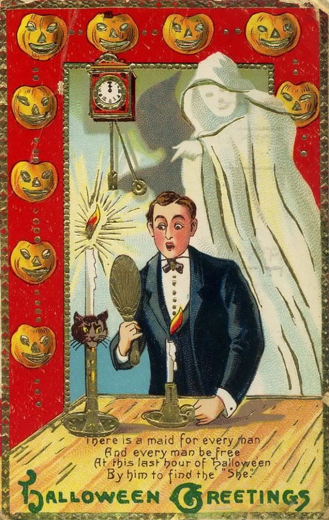
#24 Halloween Greetings
Brightly colored and a little mischievous, this “Halloween Greetings” cover art leans into the playful scares of early holiday ephemera. A ring of grinning jack-o’-lantern faces frames the scene like a festive border, while the central illustration sets a stagey moment: a well-dressed man with a hand mirror looks startled as a pale, sheet-like ghost…
-
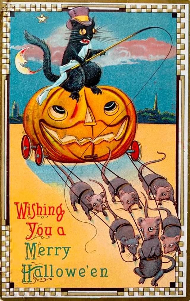
#40 Wishing You a Merry Halloween
Whimsy takes the reins on this “Wishing You a Merry Halloween” cover art, where a wide-grinning jack‑o’‑lantern becomes a rolling carriage pulled by a team of mice in tiny harnesses. Perched on top is a sharp-eyed black cat, dressed for the occasion in a jaunty cap and holding the lines like a seasoned driver. The…
-
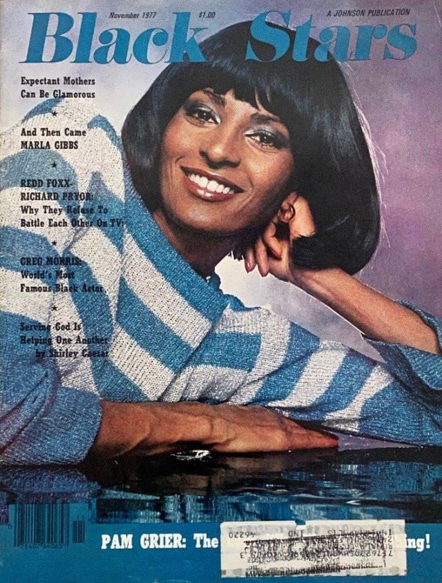
#16 Pam Grier, November 1977
A bright, confident smile anchors this November 1977 cover of *Black Stars*, with Pam Grier posed in a relaxed studio portrait that feels both glamorous and approachable. The styling leans into late-1970s fashion—bold eye makeup, a sleek bob haircut, and a textured striped knit that reads clearly even in the worn print. At the top,…
-
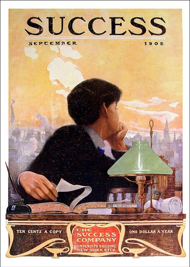
#6 Success magazine, September 1902
Boldly lettered across the top, “SUCCESS” announces itself with the confidence of a new century, and the September 1902 date sits like a timestamp on ambition. The cover art places a solitary figure at a desk, chin in hand, gazing past a green-shaded lamp toward a hazy city skyline. Warm, sunset-like tones and soft industrial…
-
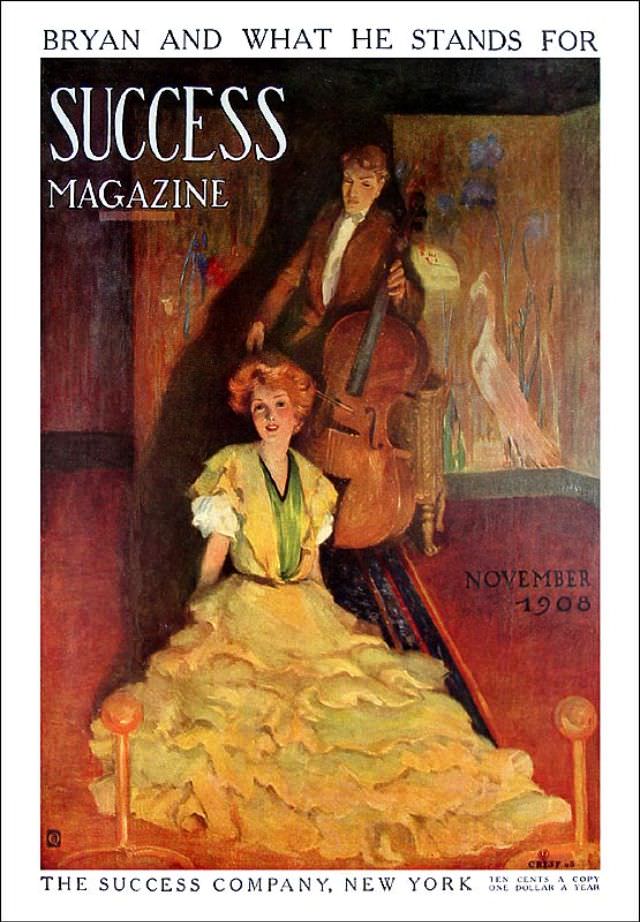
#22 Success magazine, November 1908
Bold lettering announces “SUCCESS MAGAZINE” beneath the teasing cover line “BRYAN AND WHAT HE STANDS FOR,” setting a distinctly early–20th-century tone where politics, culture, and self-improvement could share the same newsstand space. The November 1908 issue is presented as cover art rather than reportage, inviting the reader in through mood and suggestion as much as…
-
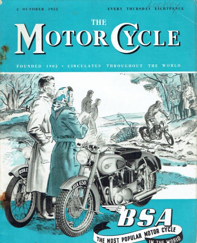
#12 The Motor Cycle magazine, October 2, 1952
Bold teal lettering crowns the October 2, 1952 cover of *The Motor Cycle*, immediately setting the tone for a mid-century world where motorcycling was equal parts practicality and romance. The masthead touts its international reach and weekly rhythm, hinting at the eager readership that once awaited each issue for road tests, industry chatter, and the…
-
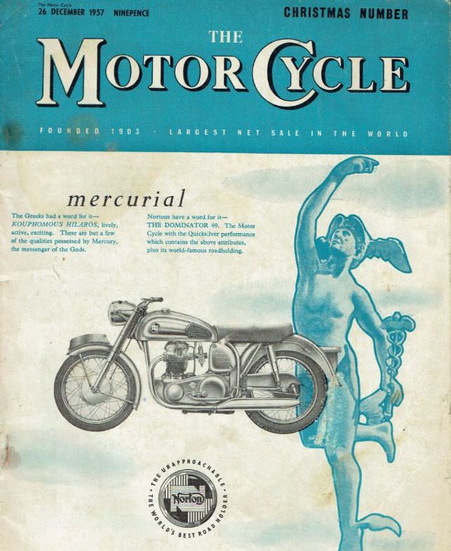
#28 The Motor Cycle magazine, December 26, 1957
December 26, 1957 lands in bold type across the top of this Christmas Number of *The Motor Cycle*, framed by a teal masthead and the proud declaration of the magazine’s global reach. The cover balances festive timing with hard-edged enthusiasm for engineering, making it instantly searchable for collectors of British motorcycling ephemera, mid-century magazine design,…
-

#9 Popular Mechanics magazine cover, August 1933
August 1933 arrives in bold red type across this Popular Mechanics magazine cover, a graphic promise of ingenuity set against a clear blue sky. The artwork is worn at the edges with creases and scuffs, the kind of honest aging that tells you it was handled, read, and saved. Even so, the design still pops:…