Category: Cover Art
Dive into a gallery of vintage cover art from books, magazines, and albums. Discover how graphic design and illustration reflected the moods of their times.
These covers capture the essence of cultural evolution — from bold propaganda to elegant minimalism.
-
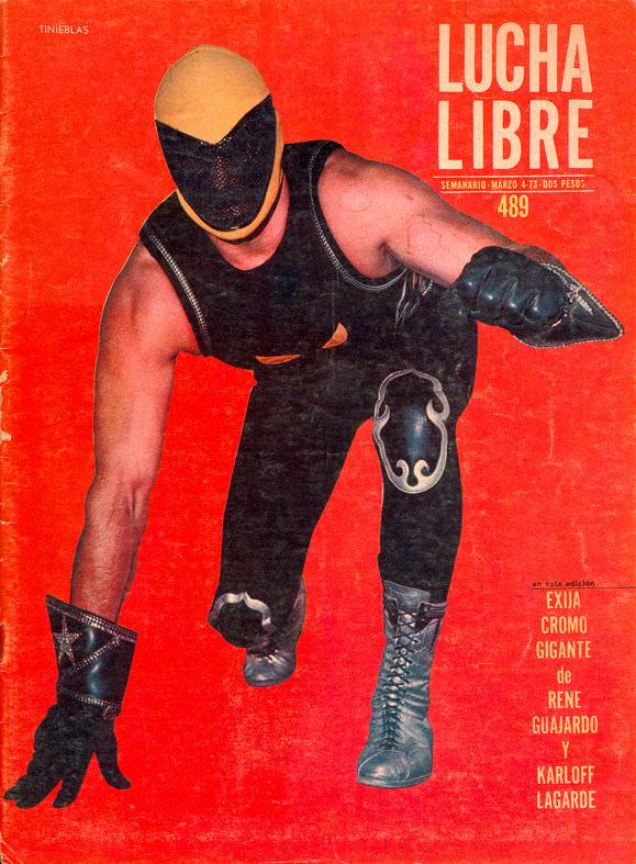
#7 Blood, Masks, and Glory: A Visual Tour Through Lucha Libre Magazine Covers of the 1970s #7 Cover Art
A punch of red dominates the cover, turning the page into a stage where masked bravado feels larger than life. Center frame, a wrestler lunges forward in a low, predatory stance, his yellow-and-black mask and black gear sharply silhouetted against the flat background. The bold “LUCHA LIBRE” masthead towers at the top, while scuffs and…
-

#23 Blood, Masks, and Glory: A Visual Tour Through Lucha Libre Magazine Covers of the 1970s #23 Cover Art
Bold blocks of color and a confrontational pose set the tone of this 1970s lucha libre magazine cover, where spectacle was the headline and the mask was the star. Against a warm, poster-like background, the masked wrestler sits cross‑legged with arms folded, presenting himself as both athlete and icon—an image designed to stop readers at…
-
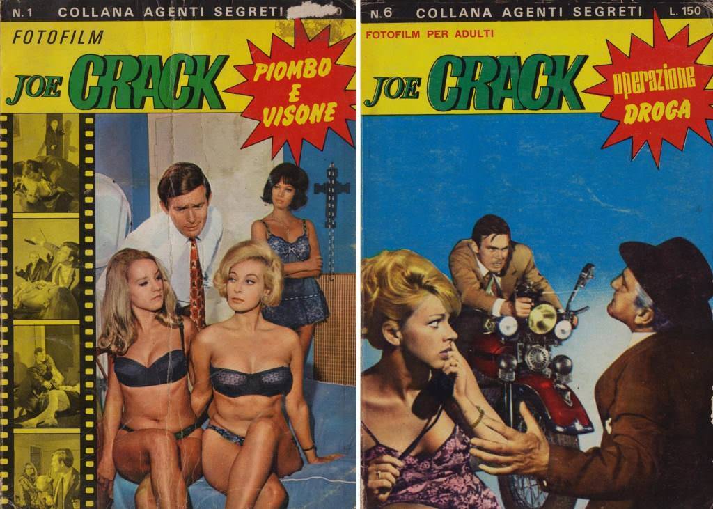
#1 The World of Spanish and Italian Crime Comics (Fotonovelas) from the 1960s-70s: Stories Told with Sensational Photogr
Bold Italian cover art bursts with tabloid energy: “Joe Crack” splashed across the top, starburst headlines shouting “Piombo e Visoni” and “Operazione Droga,” and a banner promising “Collana Agenti Segreti” and “Fotofilm per adulti.” The design leans hard into high-contrast color, oversized typography, and instant intrigue, the kind of kiosk-ready packaging that made crime fotonovelas…
-
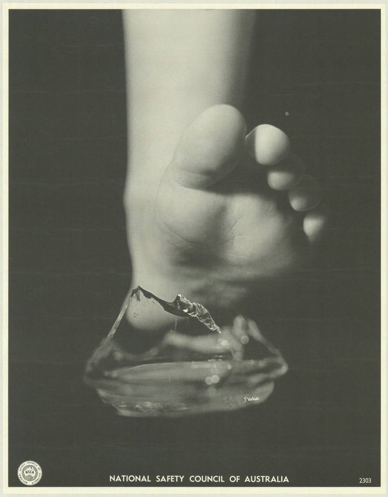
#5 National Safety Council of Australia Posters from the 1970s: Visual Messages for Keeping People Safe and Well
A child’s bare foot hovers above a jagged shard of broken glass, the sharp edge turned into a simple, unforgettable warning. The stark black-and-white composition keeps the focus on texture and danger—soft skin, hard angles, and the split second before injury. Along the bottom margin, the “National Safety Council of Australia” imprint anchors the scene…
-
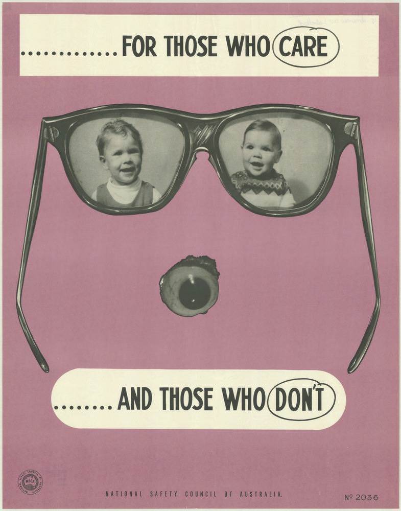
#21 National Safety Council of Australia Posters from the 1970s: Visual Messages for Keeping People Safe and Well
Bold, graphic design does the talking here: a pair of oversized glasses frames two smiling children like treasured memories, while a single detached eye below turns the composition into an unsettling warning. Across the top and bottom, the blunt slogan “FOR THOSE WHO CARE … AND THOSE WHO DON’T” lands with the kind of sharp,…
-
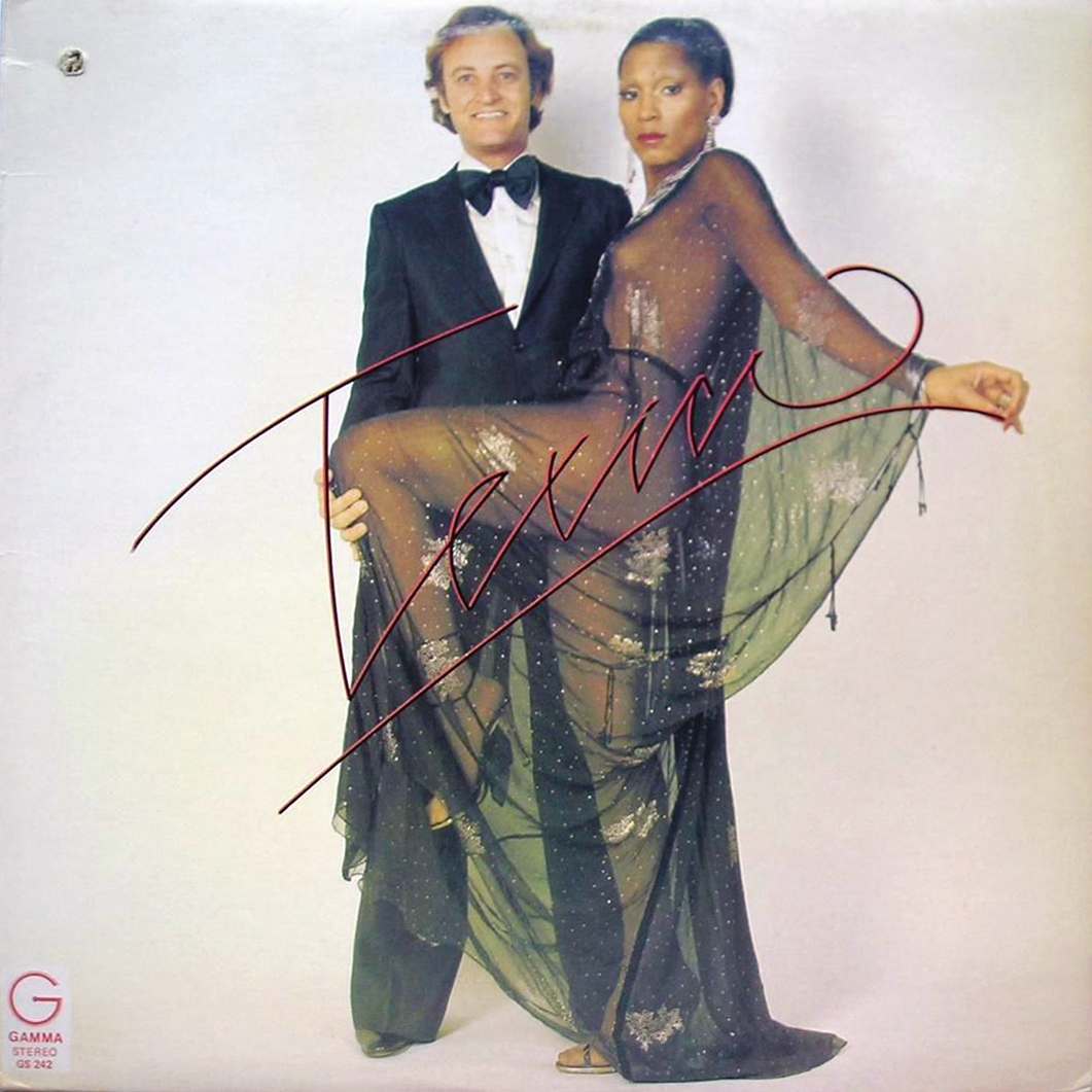
#6 The Unusual and Unconventional Album Cover Designs From the 1960s and 1970s #6 Cover Art
Elegance and provocation collide on this striking piece of retro cover art: a tuxedoed man stands steady while a woman in a sheer, glittering gown poses with theatrical confidence, her draped fabric fanning outward like a stage curtain. The stark, pale backdrop leaves nowhere for the eye to hide, turning the figures into a bold…
-
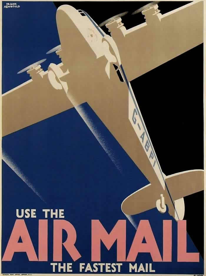
#8 Advertising the Skies: A Look at Imperial Airways Posters Promoting Early Air Travel in the 1920s and 1930s #8
Bold, streamlined design meets early aviation ambition in this Imperial Airways poster artwork, where a large aircraft climbs diagonally across a deep blue sky. The low-angle viewpoint exaggerates the machine’s scale, turning wings and engines into clean geometric shapes that feel both modern and monumental. At the bottom, the command “USE THE AIR MAIL” dominates…
-

#1 A Look Back at Vintage Modern Photography Magazine Covers from the 1950s and 1960s #1 Cover Art
Bold typography and product-forward layout dominate this Modern Photography magazine cover, a snapshot of mid-century—and early consumer—camera culture that still feels surprisingly current. The oversized red masthead, the boxed-in design, and the technical, report-like headlines point to an era when photography magazines served as both inspiration and practical buying guides, speaking to hobbyists who wanted…
-
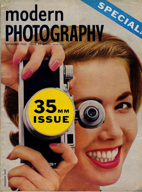
#17 A Look Back at Vintage Modern Photography Magazine Covers from the 1950s and 1960s #17 Cover Art
Bold typography and bright mid-century color set the tone on this Modern Photography magazine cover, where a smiling model lifts a compact camera to her eye and invites the viewer into the excitement of picture-making. The masthead dominates the upper left, while a diagonal “SPECIAL!” banner adds urgency and a sense of newsstand drama. Center…
-
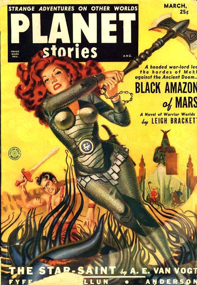
#2 Planet Stories, 1951
Bright pulp color and bold typography dominate this 1951 cover of *Planet Stories*, shouting “Strange Adventures on Other Worlds” above a dramatic scene of peril and heroics. A red-haired figure in sleek, futuristic armor strains against a chained, double-headed axe, her pose angled as if the whole moment is tipping into chaos. The warm yellow…