Category: Cover Art
Dive into a gallery of vintage cover art from books, magazines, and albums. Discover how graphic design and illustration reflected the moods of their times.
These covers capture the essence of cultural evolution — from bold propaganda to elegant minimalism.
-

#38 Cavalcade magazine cover, March 1955
Bold lettering and mid-century color set the tone on this Cavalcade magazine cover from March 1955, priced at 1/6. A smiling model in a leopard-print swimsuit dominates the layout, posed against a plain backdrop that lets the figure and the title’s patterned typography do all the work. Even the worn creases and scuffs are part…
-
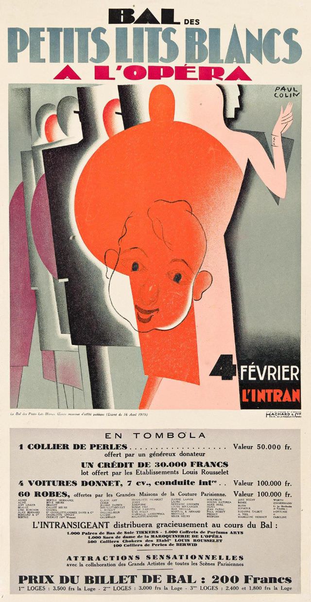
#14 Bal Des Petits Lits Blancs A L’opéra, 1930
Bold Art Deco lettering sweeps across the top of this striking cover art, announcing “Bal des Petits Lits Blancs à l’Opéra” with a punchy palette of blue, black, and crimson. The central illustration leans into stylized modernism: simplified figures, strong silhouettes, and a theatrical sense of spotlight that makes the smiling face and oversized hat…
-
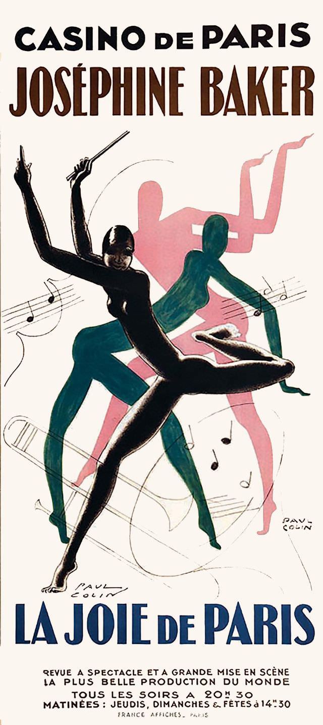
#30 Casino de Paris, Joséphine Baker, La Joie de Paris, 1932
Bold lettering at the top announces “Casino de Paris” and “Joséphine Baker,” framing a striking piece of 1932 cover art for *La Joie de Paris*. The design leans into modernist poster aesthetics: a poised, stylized performer rendered in a glossy black silhouette, posed mid-dance with an arm raised and a baton-like prop, as if the…
-
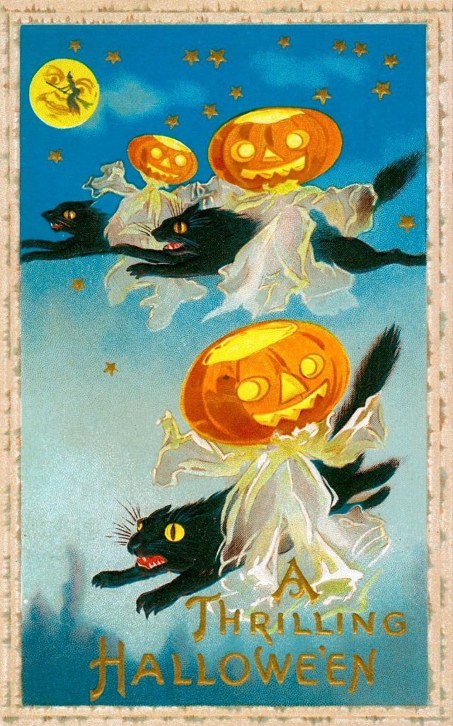
#6 A Thrilling Halloween
Under a deep blue, star-dotted sky, three mischievous pumpkin-headed figures streak across the night on the backs of black cats, their white shrouds fluttering like ghostly banners. A full moon glows in the corner with a tiny witch silhouette passing in front of it, adding a storybook sense of motion and mischief. The palette—citrus orange…
-
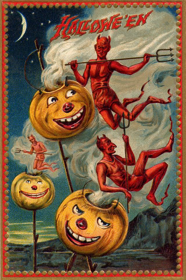
#22 Halloween Devils
Under a thin crescent moon, the word “Halloween” crackles across the top in jagged lettering, setting the stage for a mischievous piece of cover art where trouble feels like part of the celebration. Red devils tumble and perch through curling clouds, their pitchforks and tails turning the sky into a playful circus rather than a…
-
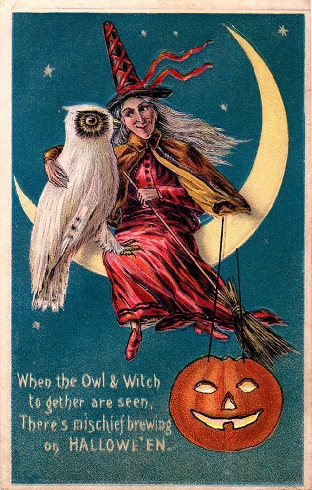
#38 When the Owl and Witch Together Are Seen
Against a deep, star-speckled sky, a smiling witch rides her broom in a sweep of motion, her red dress and striped hat ribbons catching the imagined wind. A pale owl, wide-eyed and solemn, sits close at her side as if a familiar—or an accomplice—framed by a glowing crescent moon. Below, a bright jack-o’-lantern lantern grins…
-
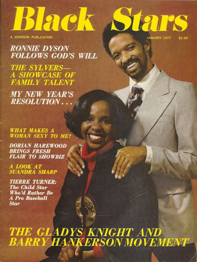
#14 Gladys Knight and Barry Hankerson, January 1977
Front and center on the January 1977 cover of *Black Stars*, Gladys Knight and Barry Hankerson pose with an easy confidence that feels unmistakably of the era. Their coordinated smiles and close, affectionate stance read like a statement of partnership, framed by bold, high-contrast typography that gives the cover its punch. Even at a glance,…
-
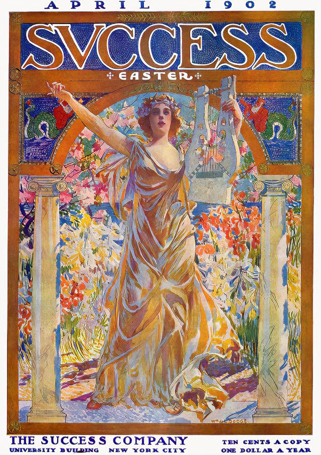
#4 Success magazine, April 1902
April 1902 arrives in bold color on the cover of *Success*, where the large, ornate masthead frames a seasonal theme labeled “Easter.” At the center stands an allegorical woman in flowing, golden drapery, arms lifted in a sweeping gesture that feels part celebration and part invitation. A garlanded crown and a lyre in her raised…
-
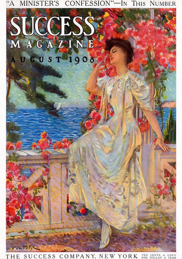
#20 Success magazine, August 1908
Summer leisure and aspiration mingle on the cover of Success magazine, August 1908, where a young woman in a flowing white gown pauses beside a terrace balustrade draped in vivid blossoms. Her relaxed pose and half-closed eyes suggest a moment of quiet confidence, framed by painterly reds and greens that feel almost perfumed. Bold typography…
-
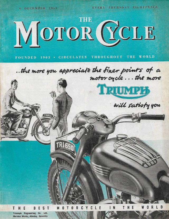
#10 The Motor Cycle magazine, December 6, 1951
Dated 6 December 1951, the cover of *The Motor Cycle* leads with bold turquoise color and crisp typography that immediately signals mid-century confidence. The masthead proclaims an international reach—“circulates throughout the world”—and the promise of a weekly read, anchoring this issue as both a piece of motorcycle history and a snapshot of post-war consumer culture.…